Vista Avenue Median Public Art Proposals
Posted on 7/20/17 by Arts & History
VISTA MEDIAN ART – REQUEST FOR PUBLIC COMMENT
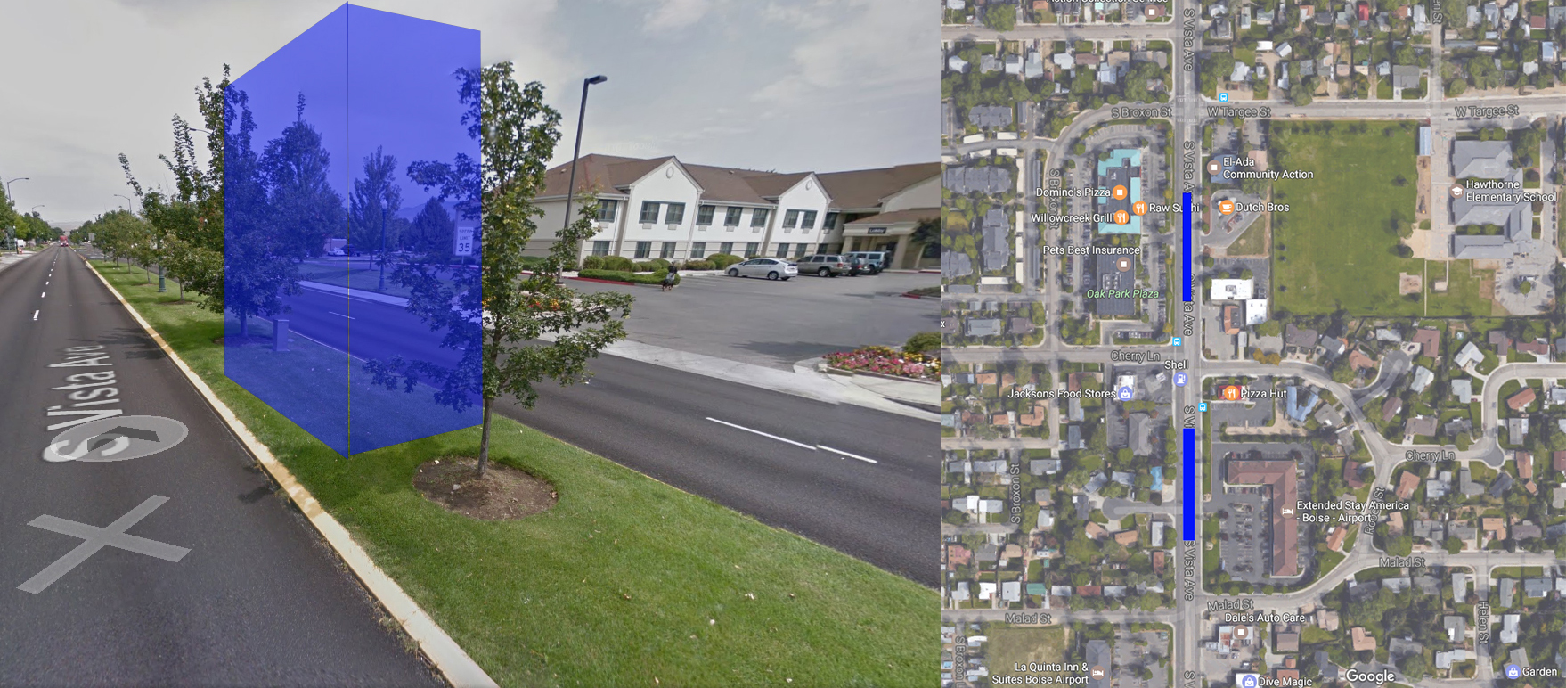
The City of Boise, in partnership with Together Treasure Valley, ACHD, and the Vista Neighborhood, placed an open call-to-artists for the placement of sculptural artwork in two medians located on Vista Avenue and has selected four local artists as finalists: Stephanie Inman, Ken McCall, Susan Madacsi, Matt Grover. Please take a moment to learn more about the project, view the four design proposals, and submit your comments by September 13, 2017. A selection panel will convene in early fall 2017 to determine which artist will win the commission. Your comments will be considered as part of their decision.
PROJECT BACKGROUND
Vista Avenue, which runs from I-84 to Capitol Boulevard and through the heart of the Vista Neighborhood, is designated as a Community Gateway by Blueprint Boise, Boise’s Comprehensive Plan. While Vista Avenue certainly serves as a gateway for many people commuting on a daily basis, it also serves as a Gateway to the Treasure Valley and even the State of Idaho, welcoming travelers from the Boise Airport as they enter the city.
For the past two years, the Vista Neighborhood has been the focus of a collaborative program called Energize Our Neighborhoods. By bringing together community partners, local businesses, residents, and public agencies, the program invites innovative, community-based solutions and aligned resources to directly improve livability on a neighborhood-level. The program began in 2014, when the City of Boise undertook an ambitious GIS mapping project, with the goal of measuring key data indicators to develop a better understanding of the health and livability of the community. Those indicators were mapped in layers, allowing strategic, focused alignment of resources from both the City and community partners to be directed to the neighborhoods with the greatest opportunity for benefit.
One key finding of initial community engagement in the Vista Neighborhood identified challenges associated with Vista Avenue itself, a five-lane corridor that bifurcates the neighborhood. Due to the high volumes of traffic and limited cultural opportunities, the area along Vista Avenue lacks a sense of place, and has, indeed, lost its historic neighborhood character. This becomes apparent as travelers make their way from the airport to downtown, where, although they are first greeted by the scenic views of the foothills, they experience a corridor dominated by strip malls, office buildings, and commercial signage. A welcoming sense of place is noticeably lacking.
Public art has the power to change the perception along Vista Avenue. Cultural facilities and public art in the area rated as the top concern among the indicators identified through the original mapping project and recent data from the Creative Vitality Index from the Western States Arts Federation.
Improvements to art and placemaking along Vista Avenue were also identified as key opportunities through the study conducted by Urban Land Institute as part of the Building Healthy Corridors Project, in which Vista Avenue was identified as one of four nation-wide demonstration corridors. This project is funded equally by a Community Development Block Grant and a Together Treasure Valley grant to celebrate the vitality of the Treasure Valley.
Please take a moment to learn more about the project, view the four design proposals, and submit your comments in the Comments section below.
Proposal #1: Stephanie Inman
Proposal #2: Ken McCall
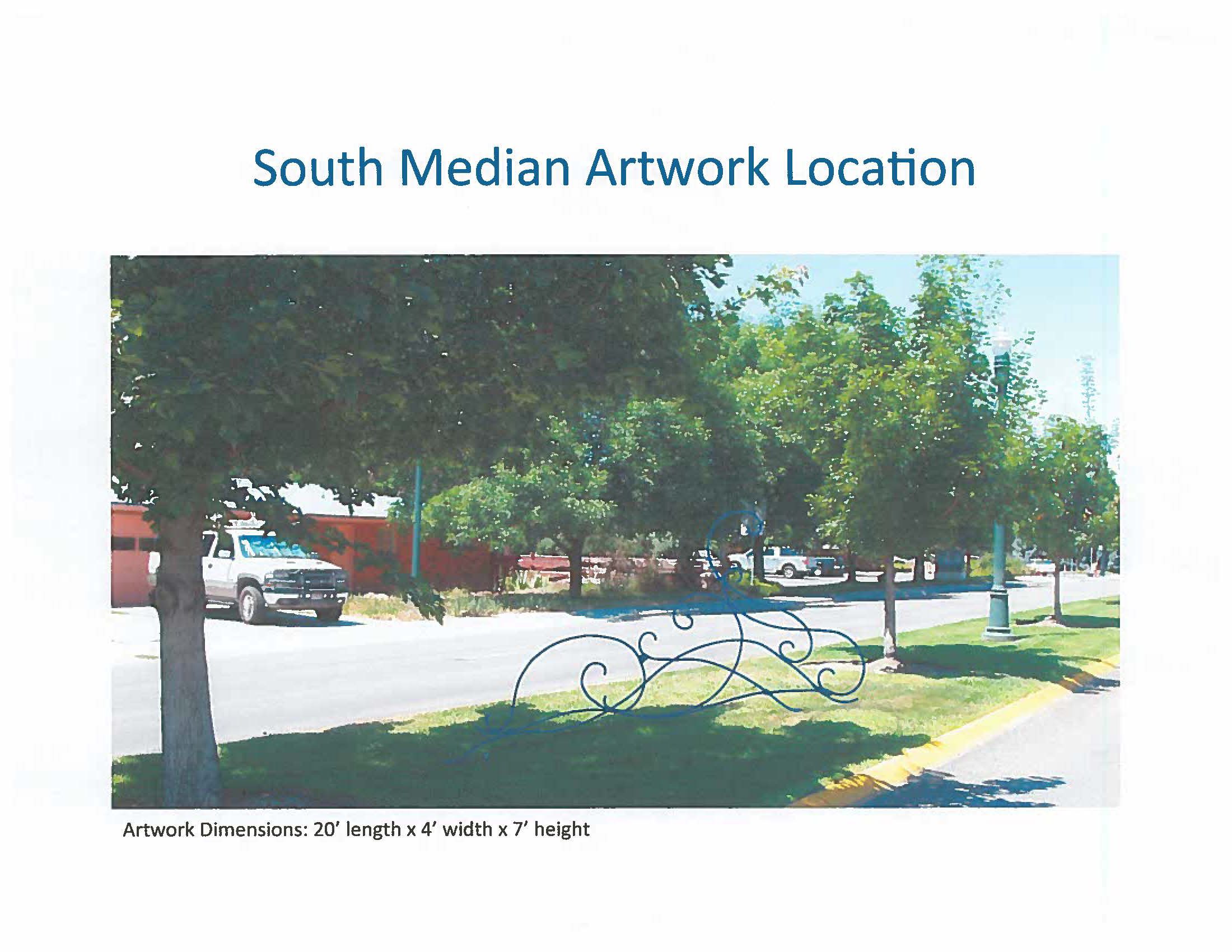
Proposal #3: Susan Madasci
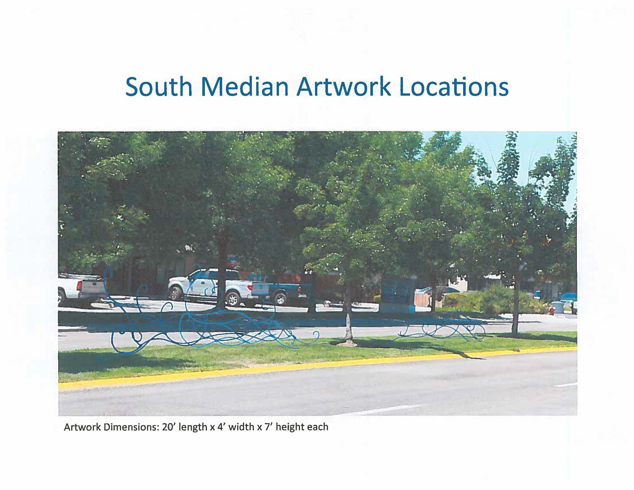
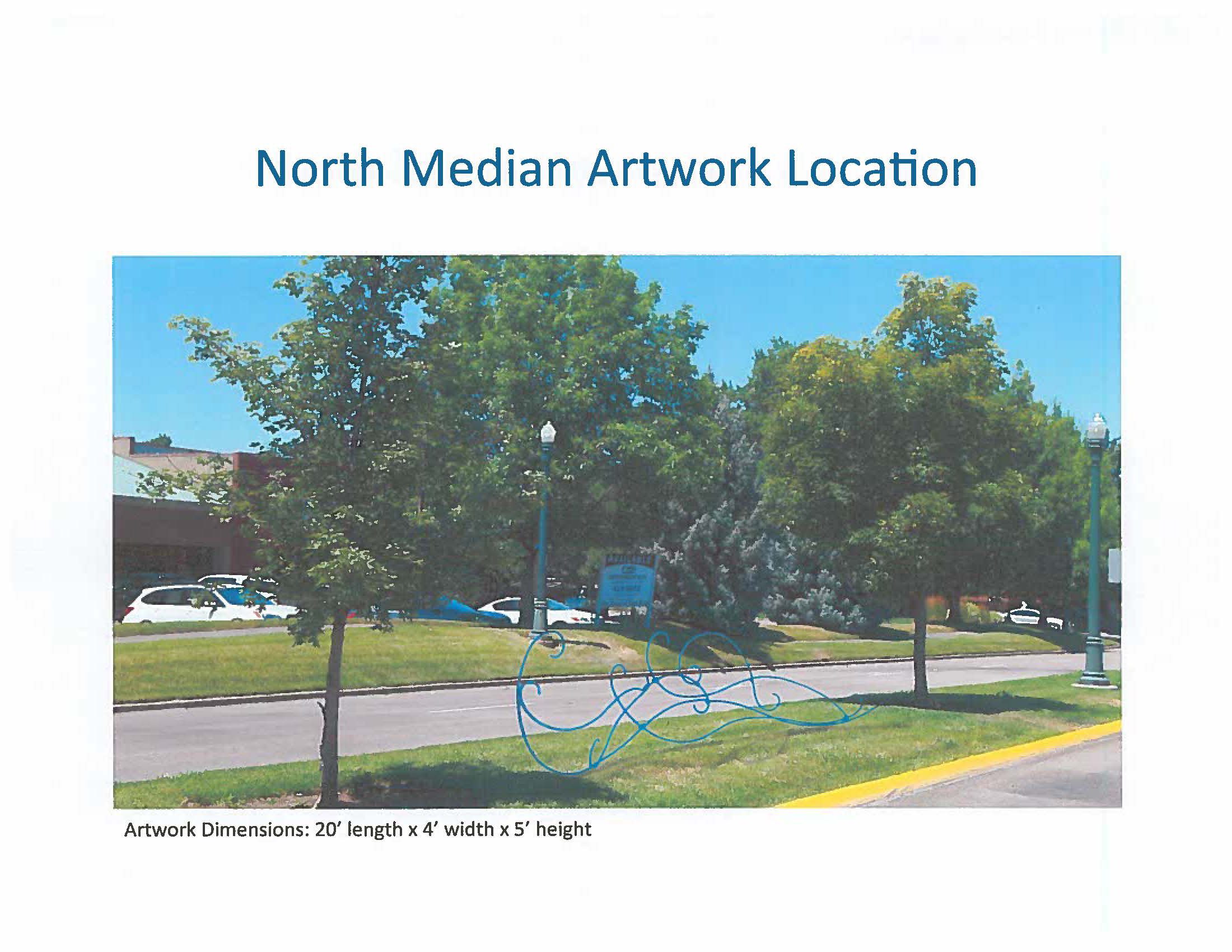
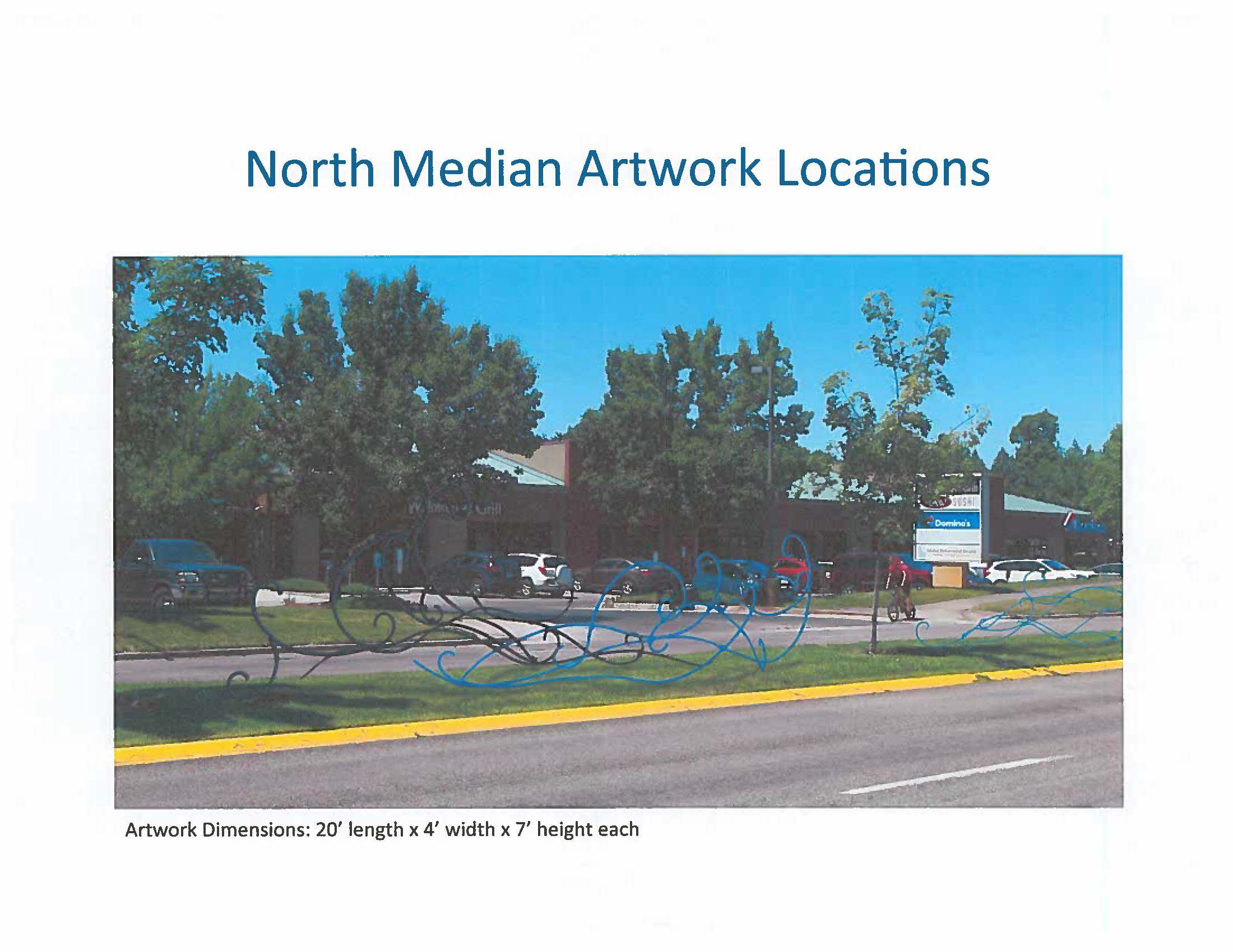
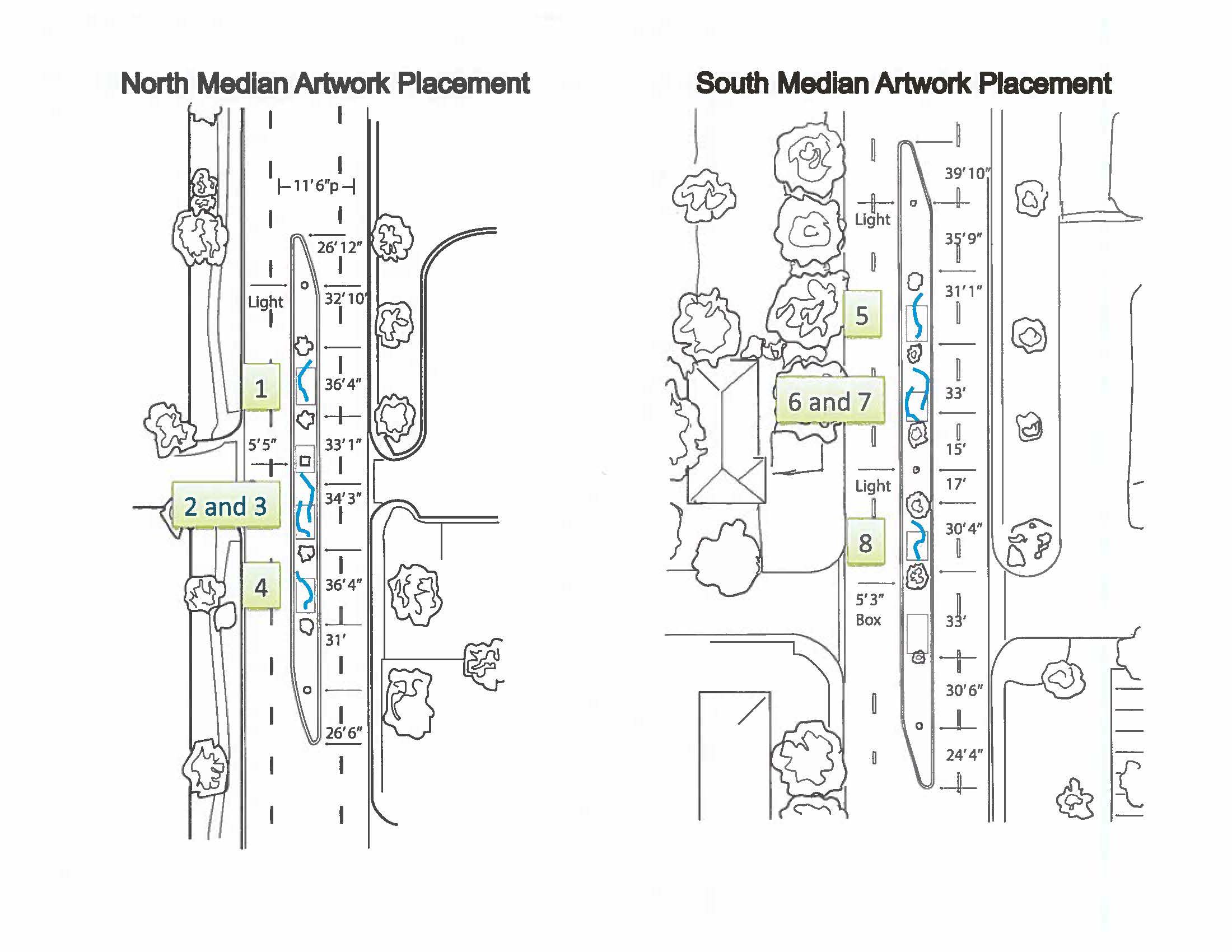
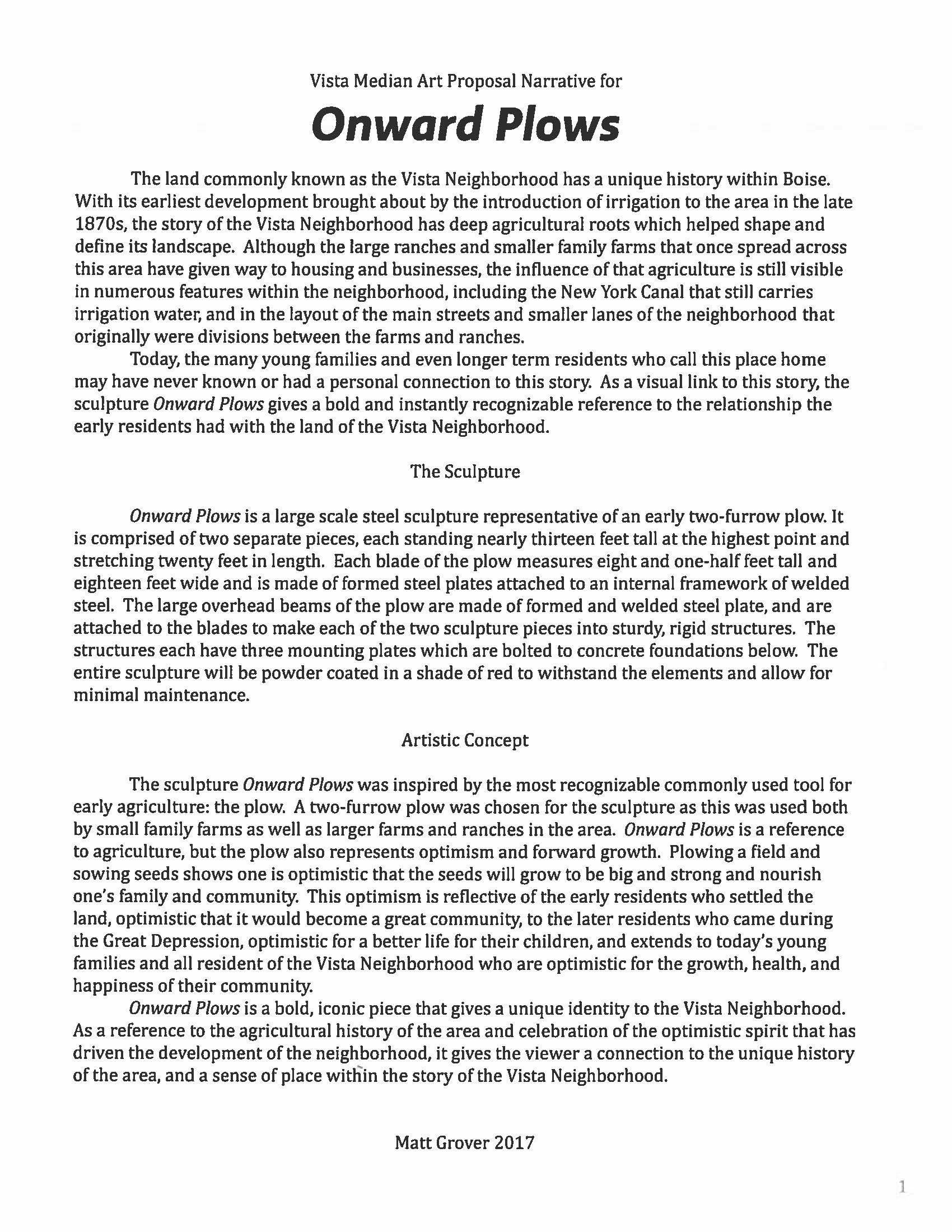
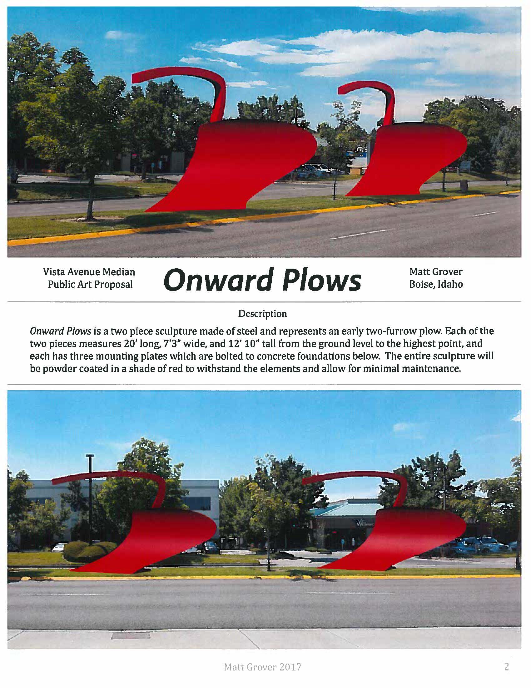
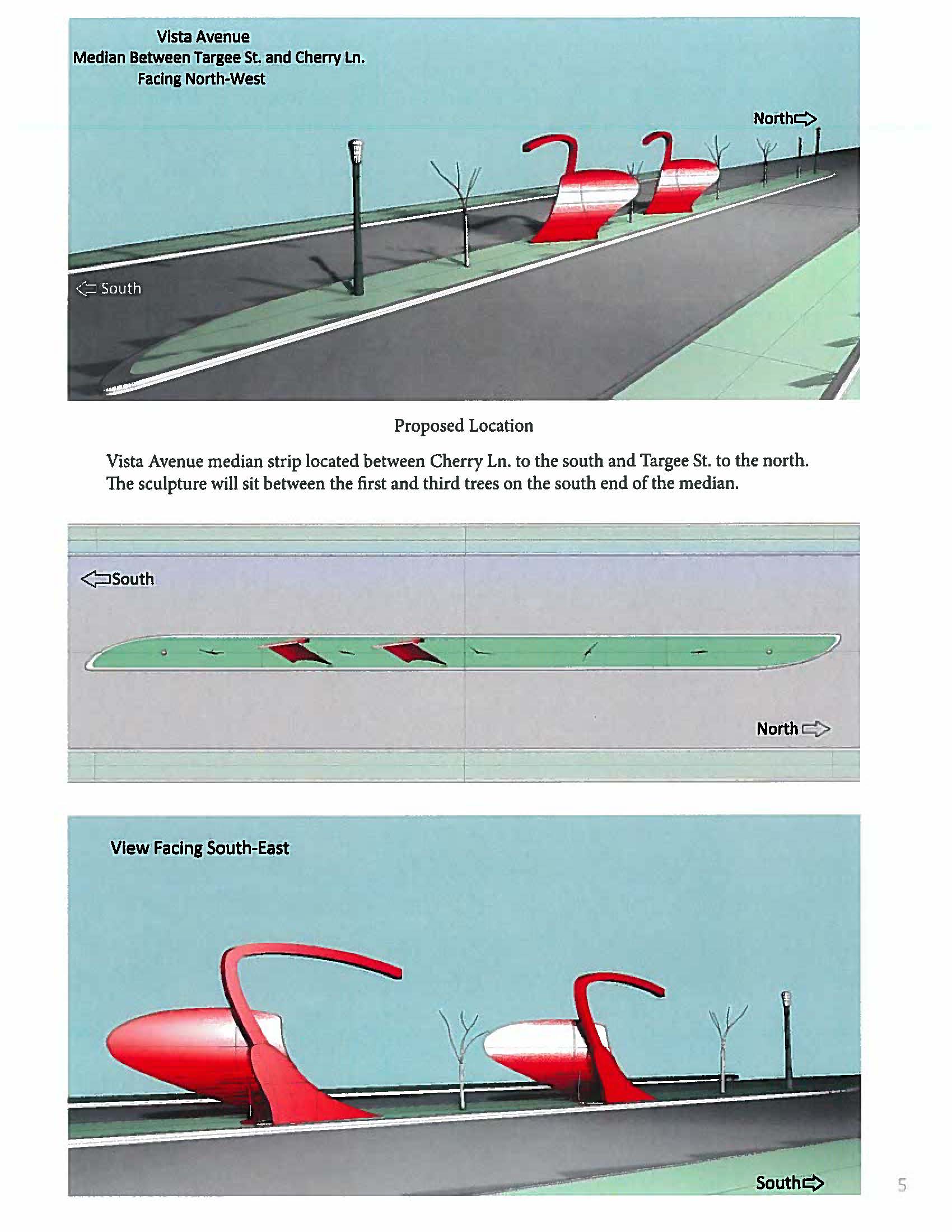
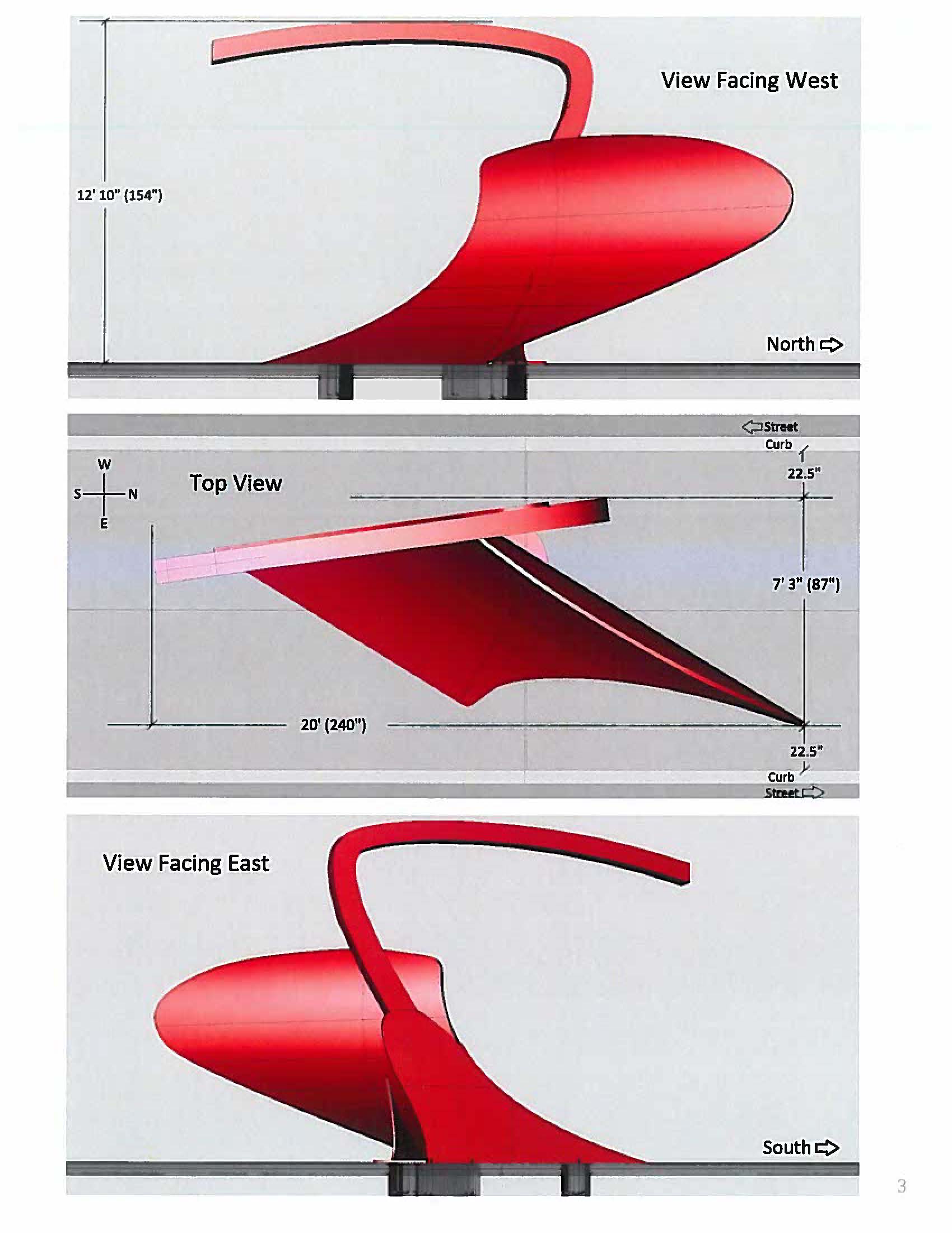
Proposal #4: Matt Grover
COMMENTS
Sarah says:
I really love the colors and beauty of Stephanie’s proposal but I would vote for Matt’s because it is bold and big and makes a statement. Thank you.
Carissa says:
I vote for proposal #2 by Ken McCall. It’s beautiful, sports striking form and ode to Bench history. #1 is nice but who is really going to sit on a bench in the middle of a median. Move that one to a sidewalk!
Pam Brewer says:
My preference is Canals to Communities.
Marsha Philbrook says:
Of the 4 I liked Ken McCall’s sculpture depicting the canals the best. The plows were too massive and I don’t think many people would even know what they are. The 3rd submission was too thin and inconsequential – hard to see. Stephanie Inman’s submission of birds and moths would be my #2 choice but benches in the median doesn’t really compute. We’ll be at the meeting tomorrow night. Thanks for the preview.
Claudia says:
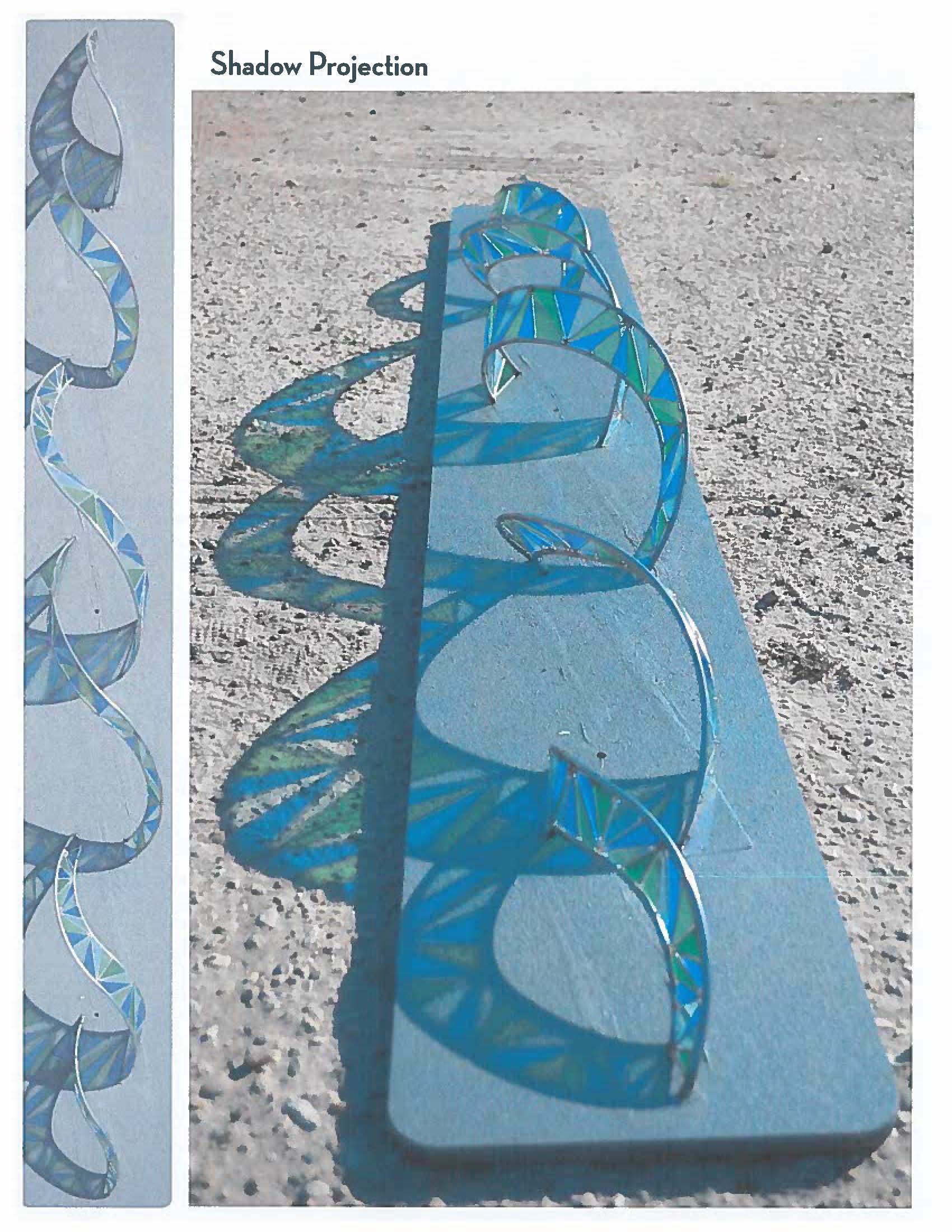
Thank you for allowing this feedback. I’ll start with my favorite which was the Aqua Vitae (Shadow Projection). It reminded me of stained glass. I live in the neighborhood and so this would be such a pretty sight each day as I go to work. My second choice would be the Hummingbirds on Benches. Unfortunately, I’m definitely not a fan of the Onward Plows. They just look harsh to me. That’s my feedback. I’m excited to learn what the final decision will be!
Betsy Appelgren says:
I prefer the “Aqua Vitae” sculpture in Proposal #2 by Ken McCall.
Robyn Paffendorf says:
I vote for Aqua Vitae!
Kelly says:
I’m torn between the first two. The humming birds and moths are beautiful and colorful, but the shadow projection of Aqua Vitae is beautiful and I love the blue and green colors.
Sylvia Marmon says:
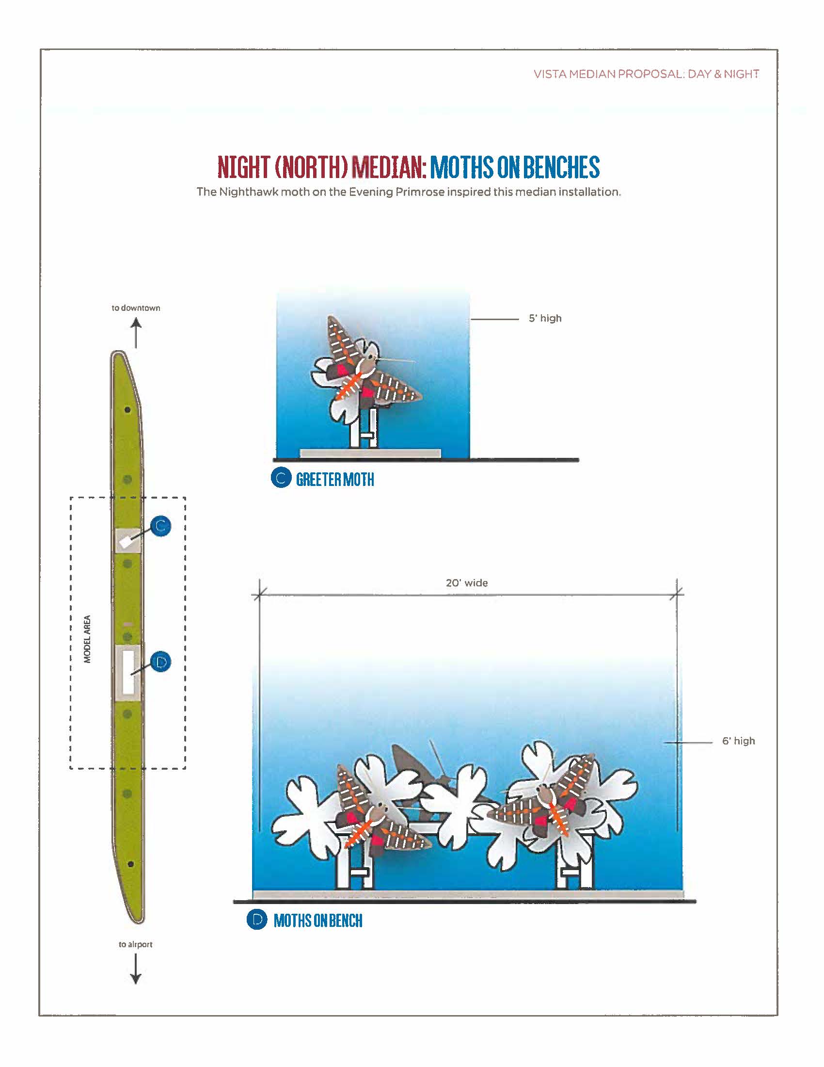
I like Stephanie’s hummingbirds, but the moths are too abstract. Susan’s design is attractive, but it feels too small for the space. Matt’s plows are too, too. . . random?, big?, awkward? That leave Ken’s Aqua Vitae. The dimensions and colors are good. And as much I like grass, the water and labor savings are valuable points to consider. I vote for Aqua Vitae.
Annie Wardwell says:
I would rate the proposals in exactly the order they are shown above, with #1 being my favorite, and #3 being my least favorite. I would suggest that #4 not even be considered.
Caile Spear says:
I like Ken McCall’s because it connects to the water in the canals, connection of replacing grass with gravel, saving water, and the movement goes along with the traffic on Vista. Artist is using acrylic and wonder if metal would be better in case of accidents or is it cheaper to replace acrylic.
So glad art is going to be installed and excited to see what will be chosen. Please consider art pieces for the Central Bench area too.
Paula Dorney says:
I love the idea of public art. Vista Ave is a great location choice. A nice welcome to those visiting Boise.
Amanda says:
I like the Day & Night idea the best although I am not sure about placing benches in the middle median of the road. My second vote would be for the Aqua Vitae. I like the thrid option too but doesn’t seem to stand out that much and the fourth option stands out WAY too much and is not pleasing to the eye at all. All in all I think adding art to these medians is a beautiful thing and also is in line with all of the other art we have throughout the city!
Lindsay says:
i like Proposal #2 best!
Angela Gilman says:
I like them all – very cool ideas. I think the FLOW concept is the best as it doesn’t block vision through the medians. I could see it getting discolored with irrigation water hitting it on a regular basis.
Willa says:
After reading and looking at all four entries and being a member of the bench, I absolutely love entry number 1 day and night by Stephanie Inman. I love the concept and think it would be a beautiful addition to Vista.
Michelle says:
Love number two, Aqua Vitae. The design is clean and works with the space. I also love the ecological conservation component of it. I think this design honors the Vista Bench’s roots, while showcasing the future.
Lorrie steinfort says:
As a long time dweller of Vista, I vote for proposal 1
Amber Smith says:
Stephanie Inman gets my vote
Sharyn Mitchell says:
I vote for Proposal #2, Ken McCall. Simple and elegant.
Gale says:
#1 Day and Night by Stephanie Inman would be my choice. The design is pleasing and colorful and not distracting for traffic. No one would have to say “What is THAT?” as it is a pleasing work of art which would be easily identifiable. The other 3 entries all immediately gave me the first impression of potentially being dangerous in the case of a fender bender accident, not to mention being distracting for drivers. The latter 3 designs would, I believe, be better reserved for a park or other area where vehicles were not driving so close to the sculptures.
Patty Phillips says:
I really love Ken McCall’s submission. Beautiful art and a wonderful concept.
Teri Hancock says:
I narrowed it down to proposal #1 & #2. I really liked the concept of the one with the moth and hummingbird and think it will look amazing. I also liked the functionality of a bench, but have a concern about a bench in the median as that may be unsafe if someone crosses the busy streets to enjoy the artwork or actually sit on them. Is there any other green space like a mini park that this design could be located in?
#2 was also a favorite and more conservation oriented with turning the green space into gravel to simulate water and preserve the sculpture. I think it would also show well from a vehicle.
#3 proposal was too thin and so would be difficult to see which made it tough to tell it represented water.
#4 proposal was my least favorite. I thought it was too big and maybe a bit outdated for connecting us to the future.
Jessica says:
I like proposal #2 best, it isn’t too in your face & is very beautiful. I also like proposal #3. I think proposal #4 looks too much like snow plows & could cause some accidents, & would get lots of complaints by how weird it looks. We want to make Boise a beautiful place, not have people wonder why we have plows for art.
Linda Paul says:
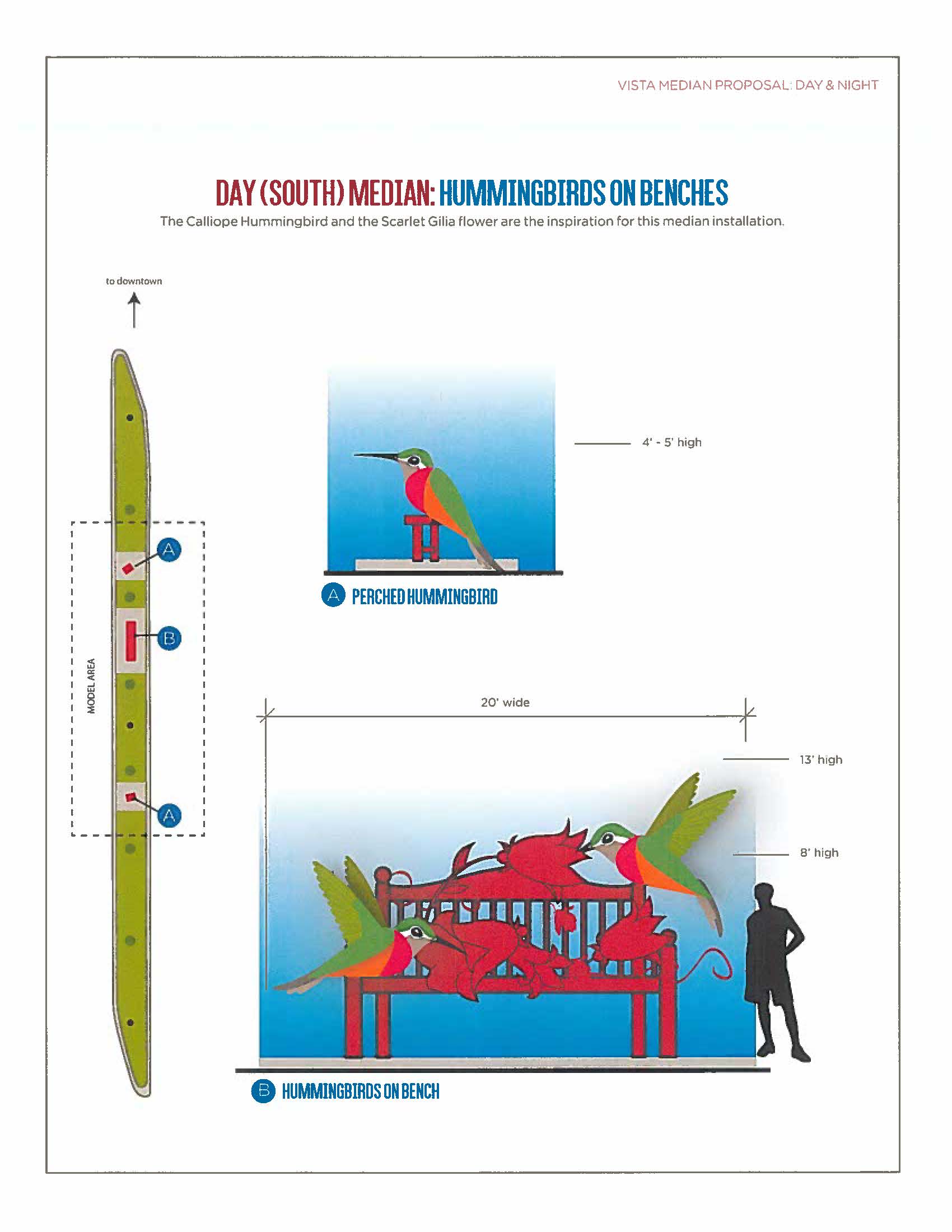
My first choice would be #1, Stephanie Inman’s Day & Night. I like her concept of drawing attention to native pollinators and plants. The only thing that concerns me is the scale of the day Bench & Hummingbirds. At 13′ high, it seems way too large for such a confined area as a median strip. If the smaller piece were 2.5-3′ high and the large piece no higher than 6′ feet, I think this option would be perfect.
Second choice would be #3, Madacsi Studio’s Flow.
I hate #4. It is WAY TOO BIG and blocky. I fear it would interfere with traffic sight lines and it looks like post WWII Soviet public art.
All the proposals seem very large. Perhaps this was due to the proposal given to the artists and perhaps there is a reason for their gargantuan size that eludes me. I don’t like in–your-face art. I think it needs to be a little more subtle and scaled to the size of the medians and the height of the cars/cyclists/pedestrians that are traveling the roadway.
Bruce Levi says:
Proposal #1 looks best
Diane Kushlan says:
Overall:
• There is a missed opportunity not to think about this location not just as a gateway to the Vista neighborhood or the City of Boise, but as a gateway to the state. There are many first-time visitors who fly into the airport, and Vista is their first impression of the state.
• It is also a missed opportunity not to think about a gateway that would slow travelers down on the street as they approach the location, so that they could better appreciate the gateway and the gateway could contribute to slowing the traffic.
• It is also a missed opportunity not to think about the gateway as a way to enhance the pedestrian environment along the street. If the only the south median is used, a raised pedestrian crossing to the median, would better connect the school and park.
Specific Comments:
• The use of a water theme or metaphor is over-used in public art in the community.
• Night & Dark: the concept is good, but the execution is fragmented and meaning of the work would be lost in translation to most.
• Flow: Would need lights to be effective. Need more presence, not sufficiently monumental.
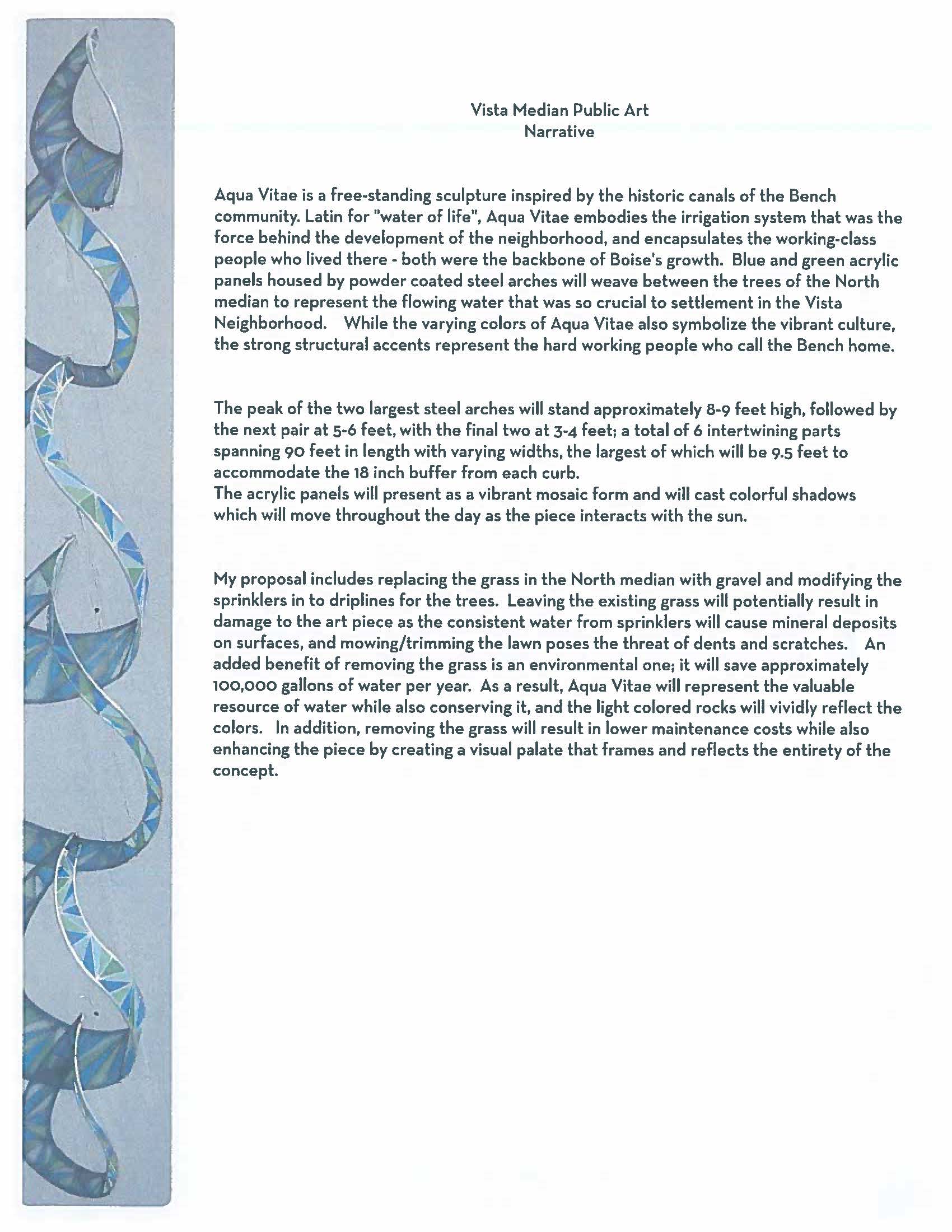
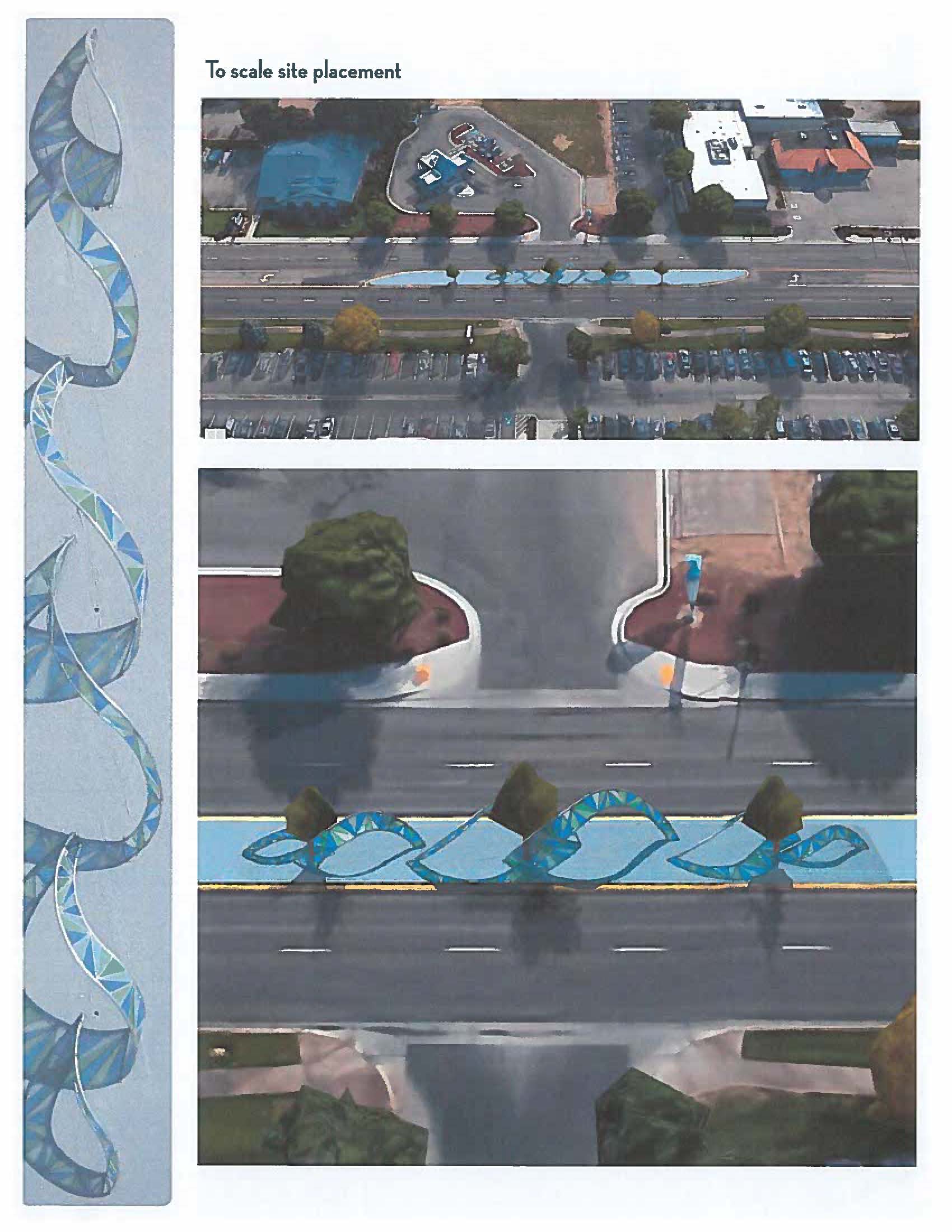
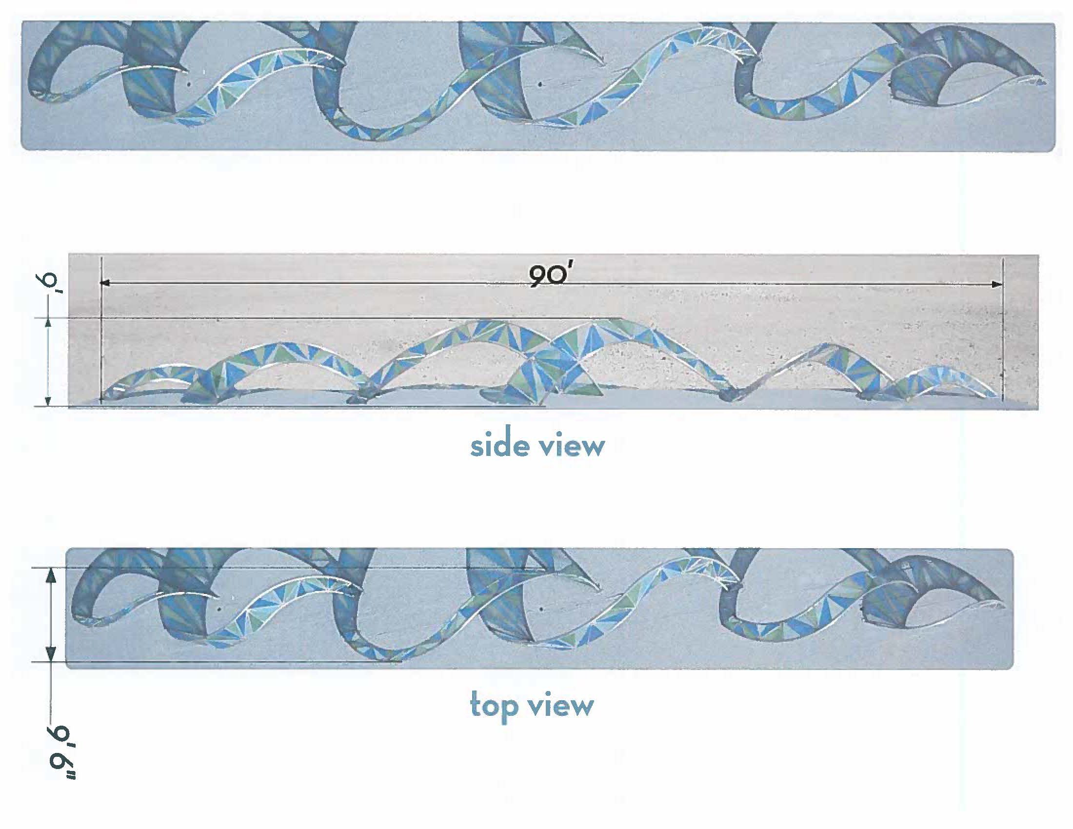
• Aqua Vitae: transparent but monumental. Light refraction through the colored acrylic shedding on to the street would extend the presence of the work. Type of river rock at the base would be important. Most thoughtful of the artists’ presentations. My choice, if I had to choose.
• Onward Planes: Like the concept and the artist’s ideas behind the piece (it wasn’t about water) but not the art.
Laura says:
I love the Onward Plows proposal. The idea of an iconic landmark can really set the neighborhood apart and create a unique identity. The color choice is classic, making the sculpture pass the test of time, never going out of style.
Rochelle Heiner says:
Ken Mc Calls sculptures are breathtaking. I and my husband enjoy seeing them so much. Each one is a lasting beautiful piece of art.
Gary McCall says:
I have enjoyed Ken McCalls Art all around the West. I have seen it in a variety of cities and it always seems to enhance the area where it is located. I hope to enjoy another one of his works along Vista. Drive around. It is hard not to notice the work of Ken McCall. If there was an artist laureate for Boise it would have to be Ken McCall getting his art education at Boise State University and now people throughout the West enjoy him as well.
Heidi says:
I just LOVE Ken Mcalls! Gorgeous!
Marilyn Swan says:
Proposal # 2 has great fluidity and such beautiful color! Ken McCall really had an eye for detail.
Karen Manter says:
Out of all the proposals, I think Kenneth McCall has the best piece. Not only is it beautiful, but love the fact it will save water!
Christena F Coonce says:
I love design #2, specifically because it incorporates water as a theme and saves water as a design element. Plus Ken creates beautiful works of art!
Craig Peariso says:
These are all pretty uninspiring.
Darla Rae Ketcham says:
I enjoyed proposal #1, but i was captivated by the blue swirls of proposal #2. In going with Boise’s theme with the river but also the soft futuristic element of forward thinking I feel like #2 would best enhance the ambiance of the city of Boise.
Pat Anderson says:
I think that the best art design was the one presented by Ken McCall. His design was so unique and had a wonderful fluidity in the design.
Alisha Anderson says:
My vote is for Ken McCall’s ‘Aqua Vitae.’ Not only is it stunningly beautiful with the different colored panels that will cast shadows as the sun hits them, it is environmentally friendly saving the city thousands of gallons of water per year. It also has the added benefit of having low maintenance costs for the city and less chances for the piece to get scratched or dented by lawn mowers, keeping it looking beautiful for years to come for all those who pass by.
Kathi Anderson says:
I love Ken McCall’s Aqua Vitae. Not only is it a stunning work of art, but it is environmentally friendly, as it will save our precious resource of water and economically sound, in that it saves the city money in maintenance costs.
Lisa Tilley says:
#2 – a peaceful beautiful piece that has an additional layer of “changing” art, from the reflections and shadows created from the primary work of art. Layers of beauty.
Christa says:
I really like the first proposal with the benches, it would be my first choice. However, I believe there could be concern with the art being actual benches – I think it likely that tourists and kids may be tempted to illegally cross to the median to sit on the benches.
Carrie Applegate says:
I prefer the Ken McCall artwork
Ashley says:
Proposal 2, Aqua Vitae is by far my favorite! I love the reference to the Boise Canals as these weave and flow through all of Boise, connecting the city and people that live here. I work off of Vista and the canal runs right behind our office and is a lovely sight to view from the windows. The idea of saving water with the input of gravel is smart, especially as we highlight saving precious resources and enhancing this space with art. The shadows that this piece reflects is a beautiful representation of art as a living thing and an integral part of the Vista Neighborhood’s cultural place in the city of Boise. This proposal is the most substantial as a statement to the Vista area!
I do also like the hummingbirds/moths on benches proposal, but I don’t see people sitting between 4 lanes of traffic or really utilizing that space as a place to sit and ponder among busy traffic. If it were re-imagined without the bench, I think that would serve the space better.
Onward Plows seems a little too harsh for this space, and feels more dividing that encompassing.
Flow, though a nice design, in comparison to the Aqua Vitae just doesn’t seem as artful or up to scale as a statement piece for the Vista Neighborhood.
John Drynan says:
It seems to me that the whole reason for the Vista median project was so that persons arriving in Boise would travel from the airport, cross the highway, and enter into Vista Avenue with an attractive sight greeting them. The artwork should be visible day or night and through all of our seasons. In light of these premises I think only the fourth entry is applicable. Having benches in the median is ludicrous unless you have a wide pedestrian crossing and speed bumps so that residents can actually sit on them. Entry #2 and #3 look so fragile and low to the ground that no one in a passing shuttle bus or taxi will even take notice, and they could be vandalized quite easily. Entry #4 is large, bright red, and will be capable of holding up to the Boise weather. Due to their size I think they would be noticed while passing by in a taxi or bus – I would probably miss the first one but would notice the second as I passed. If they can be illuminated that would of course add to the drama.
Dave Kangas says:
I apprecite the effort the artists put into researching and the thought they put into the projects. I am disappointed though in the outcome. When I envision a “gateway project” I see something that truly, undoubtably represents Bouise and Idaho. A “gateway project” on an arterial needs to be recognized for what it represents while 35-40 mph too. Of these projects I enjoyed “Day and Night” the most, FOR AN ART PIECE IN A PARK or similar setting where people can stop, gaze and enjoy the various aspects of the art. I feel #2 came the closet, even it too requires someone to interpret what the artist is trying to represent. There is nothing on this peice that causes a viewer to recgonize it as a represeantion of a stream, river or water. Project #3 is peaceful with a whimiscal feel. It felt it represented clouds more than strweam flows or water. #4 the plows is just a NO! Again, I appreacite the work that went into the projects, but I DO NOT LIKE ANY OF THEM for a gateway art piece.
Fran Ciarlo says:
I vote for #2, primarily because of the environmental aspects of the design. I also love the history behind this design. It would make for a nice plaque.
Cari Zisk says:
Honestly? I do not care for any of them – but the plows are simply horrid! The hummingbird group is attractive, however, that is a VERY busy road and I do not think we should encourage people to cross to the median to utilize benches. The “flowing” set is attractive and the least invasive.
Cari Zisk says:
Oops I missed one – the one I would choose is the stained glass effect one.
Kim Bentley says:
I personally do not care for these, especially the plows. They will block business views from one side of street to other. If the city wants to cleanup and preserve the Vista Gateway. How about NO MORE Used car lots. If repair facilities are limited to how many vehicles are allowed on location then why not used car lots. Code Enforcement needs to be proactive and start cases on some of the issues on Vista.
Jessica says:
I love the Aqua Vitae proposal and feel it would be a beautiful addition to our neighborhood. The Night and Day proposal is a close second, but the last two look rather obnoxious and potentially dangerous as presented.
SUSAN SPAGNOLO says:
Aqua Vitae is beautiful and is the most professional looking piece of art of those presented. The others looked amateurish. I love the colors and the canals are historically the life blood of the bench.
Teresa coles says:
I really like proposal number two, aquavita. I like the way the artist had thought about putting river rock down in eliminating the grass. I like the weight of the project it seems right for the space. I love the way you showed how the Sun would shine through it creating change throughout the day. And I also like that he’s done a similar project before and knows that his materials will work. This is the one!
Ken Koeberlein says:
I am an artist and live about 6 blocks from the proposed sight. Proposal #2 is by far the best project. This project has the best imagination and artistic captivation.
Nadine Stewart says:
I like proposal # 2.
Kari Overall says:
I don’t care which art sculpture you put there. I would rather the median be removed. The median by Dutch Bros causes so many problems. Cars make dangerous u-turns across Vista, they drive fast on Cherry Lane and make u-turns in front of homes, and generally make me strongly dislike Dutch Bros and all of their customers. Please remove the median rather than putting an art sculpture there.
Cherylyn Murphy says:
I think proposal #2 best represents the neighborhood. I like the idea of sharing the canal system and life giving water that helped to allow our community to grow. I think this proposal will look beautiful on the street and easily be seen.
I don’t think #1 truly captures our neighborhood although I love to watch the birds that visit my yard and the benches are pretty. #3 is not bold enough to truly be seen at 35mph. The pictures show something there but it is difficult to see what it is it is a beautiful sculpture but would be more appropriate in a park or somewhere that people will be stationary or moving slowly. #4 is a good concept but people will see giant red metal things with no idea of what they are or represent.
Ryan Adolfson says:
Proposal 2 looks amazing
Caleb says:
I vote for #2!
Holly Tastad-Pozel says:
I believe proposal #2 Aqua Vitae captures the spirit of what this project hopes to achieve, it is beautiful, portrays movement and is a lovely invitation to follow Vista into Boise. Top notch.
Anita Moore says:
Sorry, but I think some of these — particularly the moths and the alleged tractor blades — are ugly. I am in favor of cleaning up squalor around town and making it a lot nicer, including by putting up works of art, but I am fed up with my local officials foisting shapeless masses, scrap metal and other incomprehensibilities upon me as “art.” Art should be the product of authentic talent and skill, and should beautify and edify. So, good idea, but I hope you will keep looking for pieces that fit these criteria.
Nick says:
Number 2!
Ashli Stephenson says:
#2 hands down
Erynn Graf says:
I vote for #2 Ken McCall. I love the way it weaves between the existing trees, is large but see through to allow light play. I love the concept of the canals as inspiration. Thanks
zac lyles says:
#2
Uri says:
Proposal #2 mmmmm!
kacey says:
I like proposal #2 of the works submitted.
Jessica Basler says:
My vote is for proposal number 2, the others are truly no comparison.
Cheryl says:
I think the “Aqua Vitae” (2) emboldens and signifies everything Boise. The design shows an appealing continuity and I love and appreciate what it represents in regards to our water source. I feel like the color scheme and design really showcases what Boise artists have to offer.
Ash Gray Carlson says:
Number 2 by Ken McCall is my vote.
Kaden Sinclair says:
I appreciate all the artists and how Boise is increasingly making our city beautiful with art, but I would like to vote for #2, Ken McCall’s piece. He does gorgeous work and this piece is really pretty eye-catching and elegant.
Bill weppner says:
I vote for #2 proposal! (If you care)
Sara says:
I’m a fan of 2, Aqua Vitae. Thanks!!! (I’m a Boise resident)
Maria Lynch says:
Aesthetically I like #4 but functionally and conscientiously #2 makes more sense. I’d be happy with either!
David Munson says:
I think Hummingbirds on a bench would be a great choice.
KB Chaplin says:
First & second choice (very happy with either one) goes to Stephanie Inman & Ken McCall. I feed hummingbirds all summer and adore the shadow art. As a designer living and working on W. Canal St. these are what I would like to see representing my Vista neighborhood. My third choice goes to Susan Madacsi – really I would call this second choice as the first two are tied. I look forward to seeing one of the three as I drive Vista.
joan says:
I like number one. It has more color and relates to the bench neighborhood,
Marcus says:
I enjoy Proposal #1 “day and night”.
Katrine Franks says:
I really like proposal #2 and think it would be a beautiful addition to the community.
Lisa Flowers Ross says:
I think either Stephanie Inman’s or Ken Mccall’s proposal would be the best choice for the location. Both would be large enough to be viewed by quickly moving cars, are colorful and are well-proportioned to the location and seem to fit in nicely with the neighborhood.
The Flow sculpture appears too light and delicate and seems like it would not be easily seen by cars passing by. The Onward Plows sculpture feels more industrial instead of agricultural and seems to overpower the location and neighborhood vibe.
Nancy Merrill says:
I love the Day & Night and Aqua Vitae proposals! They’re both beautiful and are good representations of our part of Boise. I like the idea of Flow but the work isn’t substantial enough – if the material were thicker, it could be more easily seen by people in vehicles. As much as we want to encourage walking and cycling, the fact is that more people go by in cars than on foot/bike. The plows almost block the view, but they’re eye catching and a great nod to our history.
Megan says:
#2!
Eve-Marie says:
I like the concept and structural visibility of #2. It will be eye-catching moving 40mph on Vista. I appreciate there is more to the history but the experience of the audience is most important here. Boise I hopes will consider high impact and engaging visuals as our visitors enter the city. It is colorful, high impact and appropriate for Vista Median.
Thank you!
Katie Ranger says:
I like #2!
Christine Koeberlein says:
My personal vote would be Proposal #2, hands down. The design simulates a beautiful flow for the space, and the colors simulate that of nature. Any other choice, I would be extremely disappointed. I so hope that the majority of the public opinion feedback would be in agreement! I am a native Idahoan & have spent a substantial time of my life (64 yrs old) with family in Boise, some family right off Vista. So I feel justified in my preference. Thank you for the opportunity to comment.
Krista Bloom says:
I vote for #2